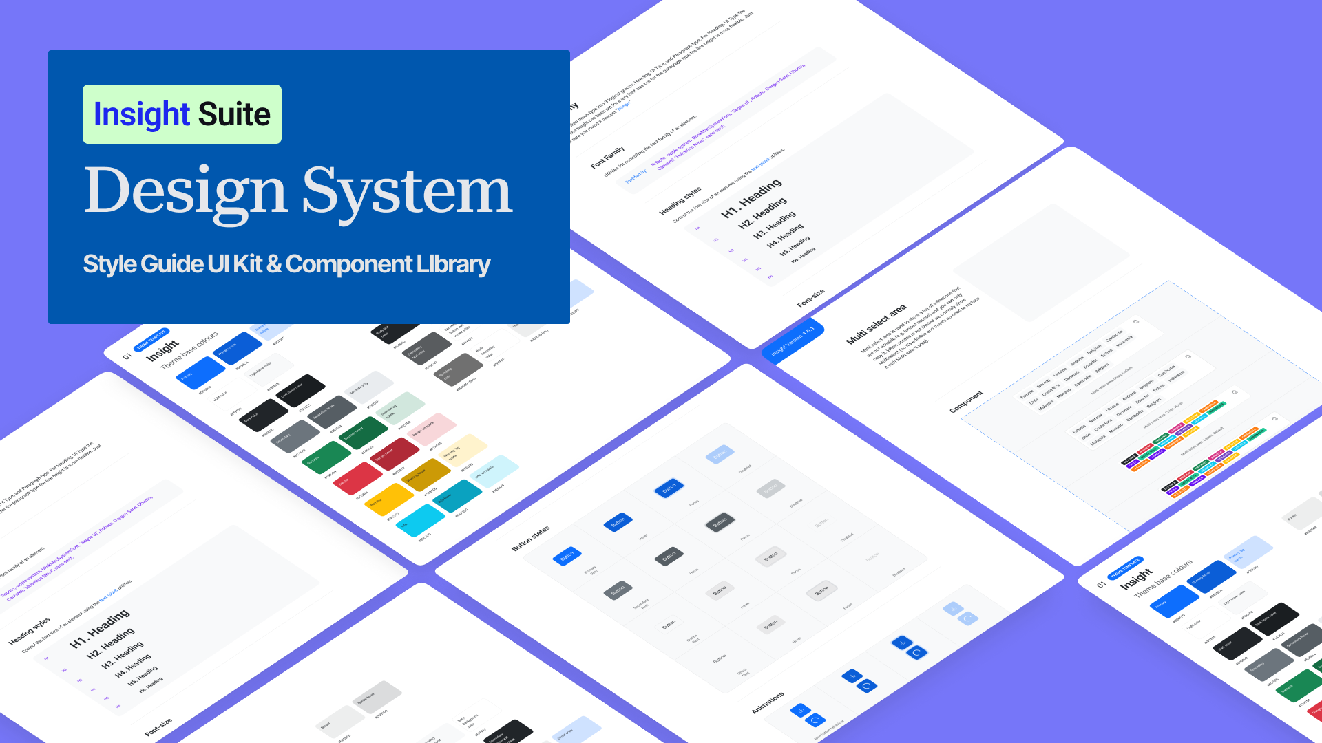
Designing Consistency at Scale: The Insight Suite Design System
I led the creation of a unified design system for the Insight Suite — a family of four enterprise products. The goal was to eliminate inconsistency, accelerate design-to-development workflows, and provide a scalable foundation for future growth.
Insight Suite is a SaaS ecosystem of four interlinked products – Capture, Review, Planner, Connect. Each product had grown organically under different teams. Over time, this created:
Inconsistent visual identity → each product looked like it was built by a different company.
Duplicated development efforts → common components like buttons, tables, and modals were built multiple times.
Fragmented user experience → users switching between products felt lost and confused.
The mission was to create a scalable design system that would unify brand identity, reduce design and dev effort, improve accessibility, and support long-term growth across all products.
Deep Dive:
Research & Discovery
Research Phase
01
Methods Applied
UI Audit (120+ screens)
evealed fragmented grids, inconsistent spacing, and at least 6 variations of primary buttons.
Stakeholder Interviews
Developers complained about wasted time rebuilding components. PMs wanted faster delivery. Customer success teams flagged onboarding issues.
User Interviews
From analysts to operations managers. Many expressed frustration with having to “re-learn” each product.
Competitor Benchmarking
tudied Material Design (scalability), Polaris (brand voice), Atlassian (SaaS complexity). These became the baseline references.
Research Phase
02
Key Insights from Research
UI Inconsistency Across Products
Users struggled when switching between products due to mismatched layouts, patterns, and interactions.
Redundant Component Development
Developers repeatedly recreated similar buttons, tables, and forms instead of using shared components.
Lack of Brand Cohesion
The products looked like separate entities rather than a unified suite, weakening brand identity.
Accessibility Gaps
Low-contrast text, missing alt tags, and inconsistent typography created barriers for inclusive use.
Research Phase
03
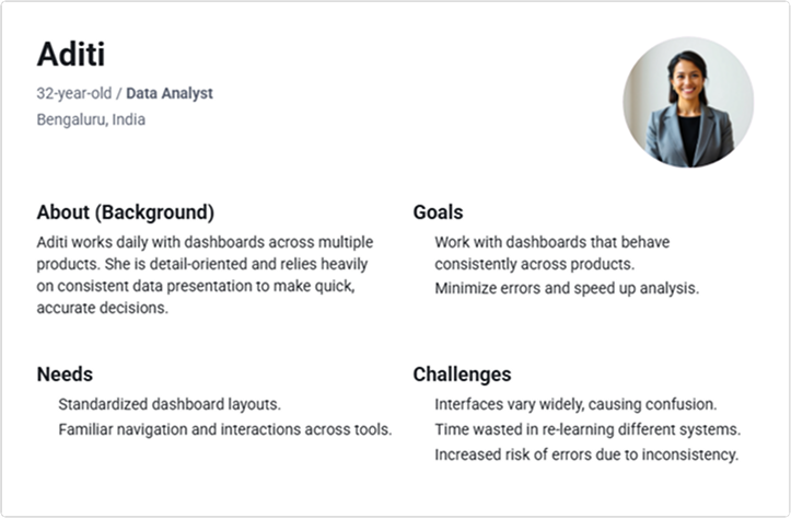
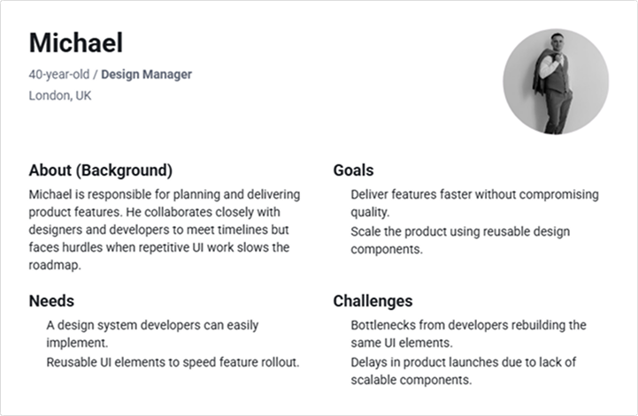
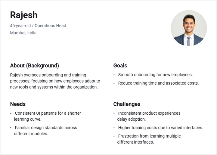
User Personas
To better understand the challenges faced by different stakeholders, we mapped out key personas representing primary user groups. Each persona highlights their role, age, goals, frustrations, and needs in relation to the product experience. This allowed us to align design solutions with both business and user priorities.
Insight: Across all personas, a shared theme emerged — the desire for familiarity, consistency, and speed. Users expect a unified experience that minimizes re-learning, accelerates work, and supports scalability.
Research Phase
04
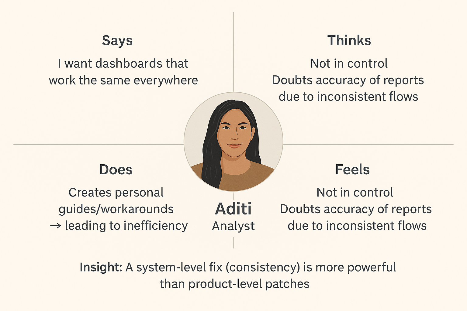
Empathy Map Deep Dive (Aditi – Analyst)
To uncover deeper behavioral patterns, we mapped Aditi’s experiences across what she feels, thinks, says, and does in her day-to-day work. This exercise highlighted the emotional and practical friction caused by inconsistent product flows, shaping critical insights for the design system strategy.
Research Phase
05
Competitor Analysis – Extended Takeaways
As part of the discovery phase, we conducted an in-depth competitor analysis to evaluate how other SaaS platforms approached design systems, dashboard consistency, and cross-product scalability. This exercise helped us benchmark best practices, identify gaps, and define opportunities for differentiation.
Competitor Analysis – Design Systems Benchmark
Design System
Consistency
Scalability
Accessibility
Brand Alignment
Documentation
Atlassian
Reusable components
Strong component library; plugin ecosystem
Accessible contrast
Clear brand guidelines
Developer-friendly, detailed docs
Carbon (IBM)
Modular architecture
Enterprise-ready across complex products
Inclusive components
Tailored tone & global usage
Comprehensive governance model
Ant Design
Code portability
Suited for large enterprise apps
Navigation assist
Adaptive styling
Clear examples; lighter governance
Bolt
WYSIWYG builder
Lightweight & fast for startups
Keyboard navigation
Consistent look & feel
Moderate depth
Insight: Competitor analysis confirmed that the biggest differentiator isn’t just having a design system—it’s how well the system is maintained, governed, and adopted at scale. While visual consistency is foundational, the true value comes from enabling speed, reducing onboarding effort, and building user trust through a unified experience.
Defining the Solution: Goals & Strategy
The Core Problem Statement
“Insight Suite users experience fragmented UX and inefficiencies due to the lack of a unified design system, leading to slower adoption, increased dev overhead, and inconsistent brand perception.”
Improve Usability
Simplify navigation and streamline workflows to reduce task completion time by 30%.
Enhance Efficiency
Introduce smart automation and data pre-filling to minimize manual entry.
Modernize Aesthetics
Implement a clean, consistent design system to improve visual appeal and trust.
Increase Satisfaction
Foster a more engaging and less frustrating user experience across all key touchpoints.
Crafting the Experience: Design & Iteration
The Design Phase established scalable foundations and modular components to unify the Insight Suite. A consistent visual language (colors, typography, grid, icons) was defined, followed by a component library structured into atoms, molecules, organisms, and templates for reuse across products. Patterns and accessibility standards ensured usability, compliance, and familiarity, while documentation and governance created a single source of truth and sustainable adoption. Together, these steps transformed fragmented products into a cohesive, efficient, and inclusive ecosystem.
Design Phase
01
UI Foundations
Color Palette
The primary and secondary color schemes, ensuring brand consistency and accessibility.
Typography Scale
Defined font sizes, weights, and line heights for headings, body text, and UI elements.
Iconography Set
A comprehensive library of vector icons for various functionalities and visual cues.
Grid & Spacing System
Guidelines for consistent layout, alignment, and spacing using an 8-point grid.
Design Phase
02
Component Library
Atoms: The Building Blocks
Buttons
Primary, secondary, and ghost buttons with various states.
Inputs & Text Areas
Form fields with states for active, error, and disabled.
Checkboxes & Radios
Standard selection controls for forms and settings.
Badges & Tags
Small labels for categories, statuses, or alerts.
Molecules: Combining Atoms
Navigation Menus
Component for primary and secondary navigation.
Cards
Modals & Dialogs
Modals & Dialogs
Overlays for important information or user input.
Pagination
Controls for navigating through large sets of data.
Organisms: Functional Interfaces
Header & Footer
Consistent global navigation and information footers.
Data Tables
Displaying complex data in a sortable, filterable format.
Charts
Pre-designed grid layouts for displaying analytics and key metrics.
Outcomes & Impact
Measuring the impact and success of our design system.
+0%
Design Consistency
Increased uniformity across all product interfaces.
-0%
Development Time
Reduced time spent on UI implementation and bug fixes.
+0%
User Satisfaction
Improved user feedback scores and task completion rates.
+0%
Accessibility Score
Significant improvements in WCAG compliance across the suite.
Reflections & Learnings
The Insight Suite Design System represents a monumental leap forward for the client. By fostering collaboration between design and engineering, we not only delivered a comprehensive toolkit but also instilled a culture of consistency and user-centricity. The measurable improvements in development efficiency, design consistency, and user satisfaction underscore the profound impact of a well-executed design system. We believe this foundation will continue to drive innovation and provide a superior experience for years to come.